Identity confusion
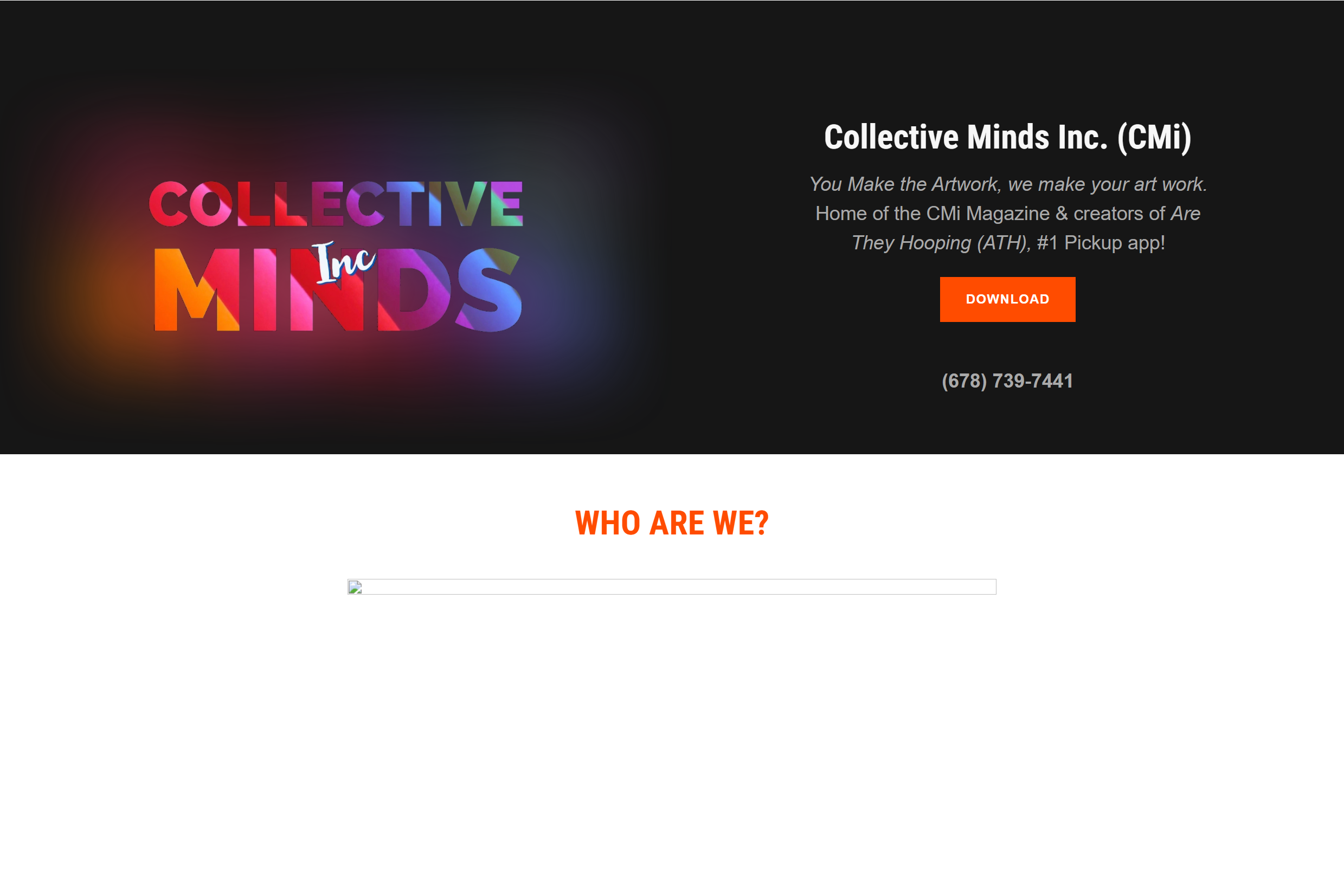
The homepage was an art collective, a basketball app landing page, a magazine store, and an agency all at once. A prospective client could not answer "what does this company do for me?" in the first scroll.
Transforming a 2019 GoDaddy template site into a modern digital agency presence. A full rebuild covering brand voice, information architecture, content strategy, and a WordPress platform the client owns.
Collective Minds Inc. began as an indie art magazine in 2014 and evolved into a digital agency offering app development, web design, and marketing. The website never made that journey with them. It still spoke to a magazine audience while the business was selling engineering engagements. My job: close that gap.
The audit surfaced a site that was actively contradicting the company's pitch. If you sell premium digital services, your own website is Exhibit A.
The homepage was an art collective, a basketball app landing page, a magazine store, and an agency all at once. A prospective client could not answer "what does this company do for me?" in the first scroll.
Development and marketing, the actual revenue drivers, lived behind a "MORE" dropdown. The digital marketing intake form sat three screens deep on the contact page, below unrelated content.
The CEO page carried a full-length poem, a basketball biography, and a downloadable resume, framing the founder as a job seeker rather than an agency principal. Body copy ran 200+ word paragraphs with no hierarchy.
Broken image placeholders, duplicate stacked navigation bars, default cookie banners, and a third-party builder credit in the footer signaled a DIY build to every visitor.
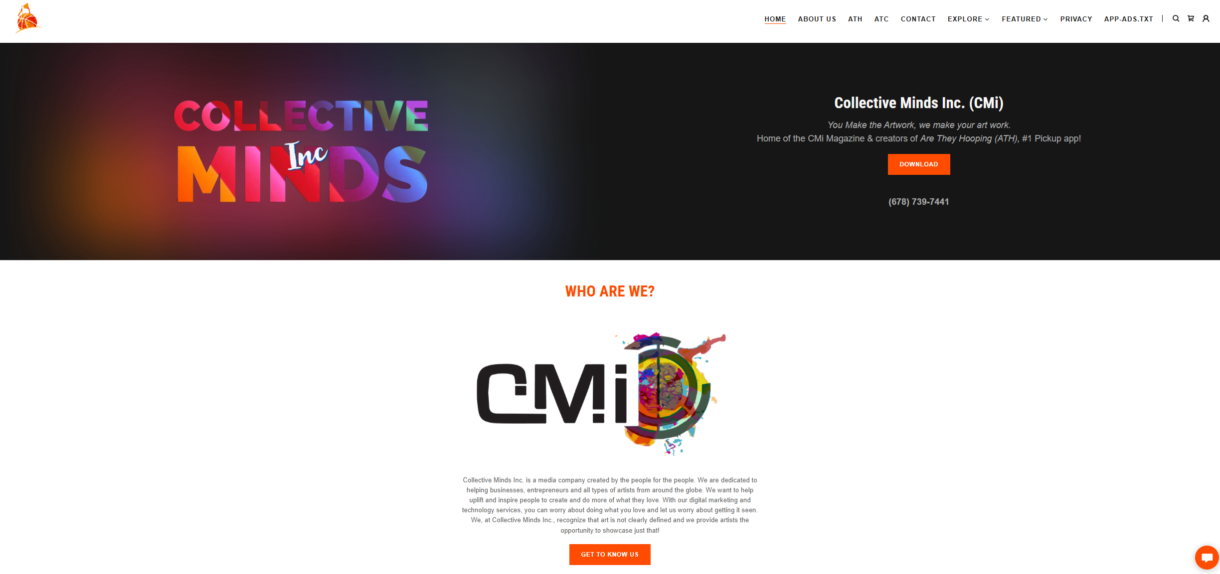
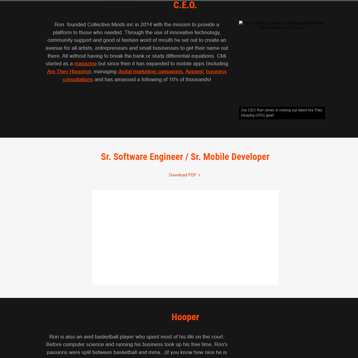
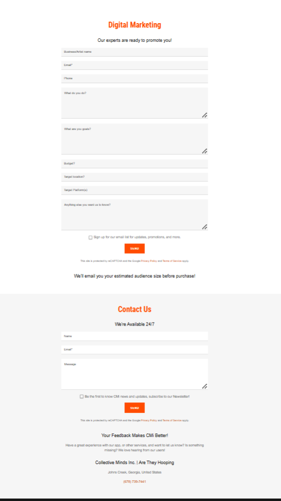
I mapped every page and CTA on the legacy site, then collapsed a sprawling navigation of 10+ links and dropdowns into five top-level destinations: Development, Marketing, Pricing, Media, About.
Every page now sits one click from home, and a persistent "Start Project" button anchors the primary conversion path in the header.
Services buried in dropdowns, no clear path to revenue pages.
Every page one click deep, one persistent conversion path.
The site copy was rewritten around a single positioning line, "Digital. Defined.", cutting homepage word count by roughly 60%. The magazine-era story was not deleted; it was reframed as an evolution arc, "From Stories to Systems", turning history into differentiation.
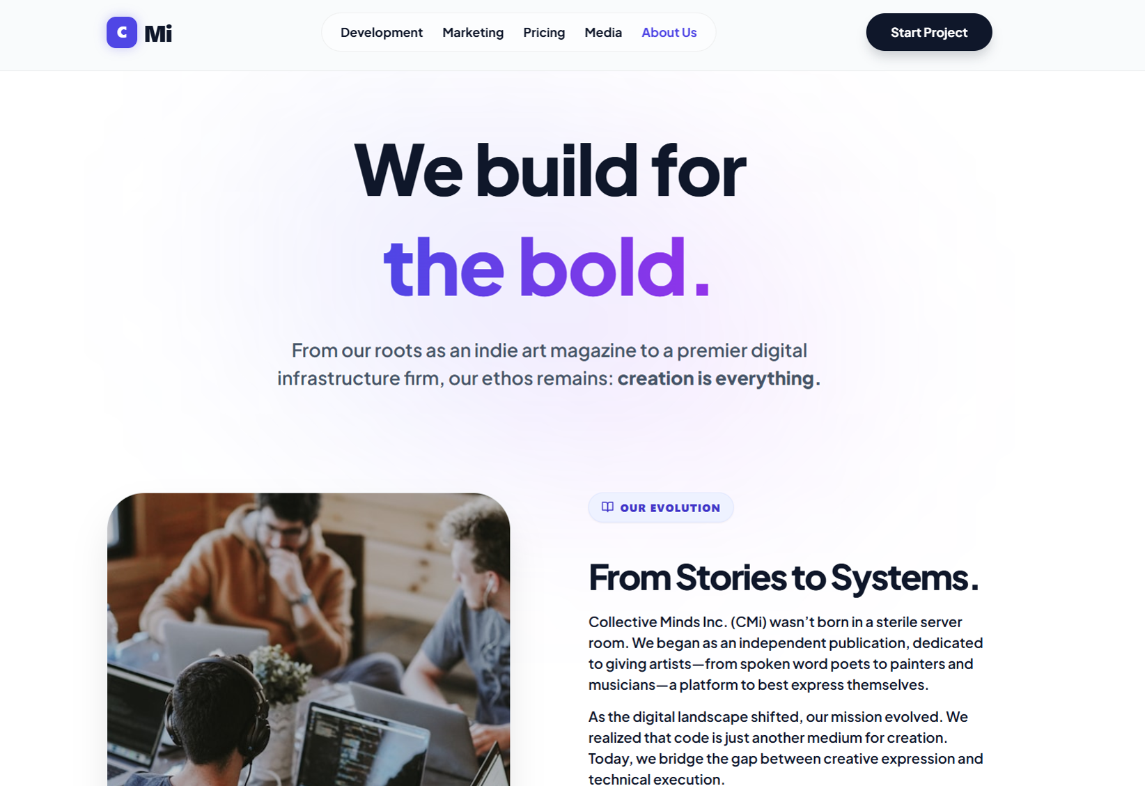
The poem, embedded resume, and basketball biography were replaced with a tight credential block: bilingual computer scientist, published author, iOS/Android engineer, founder at 19. Same facts, agency framing.
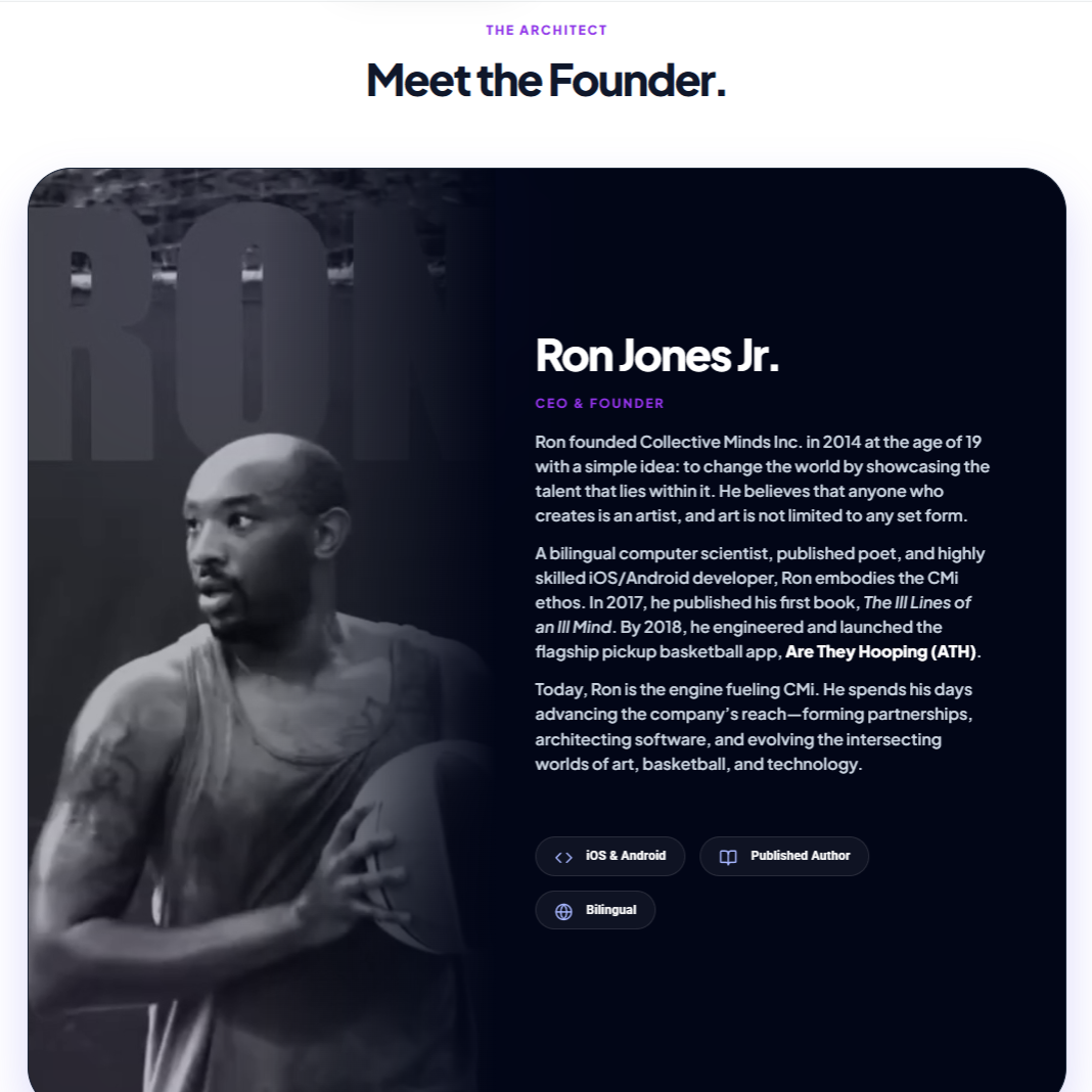
A restrained palette with strong typographic hierarchy replaced the orange-on-black template. Trust signals moved above the fold: awards bar, press mentions, named testimonials. Rebuilt on WordPress with Elementor, custom breakpoints, SVG icons, font-display swap, and analytics wired in from launch day.
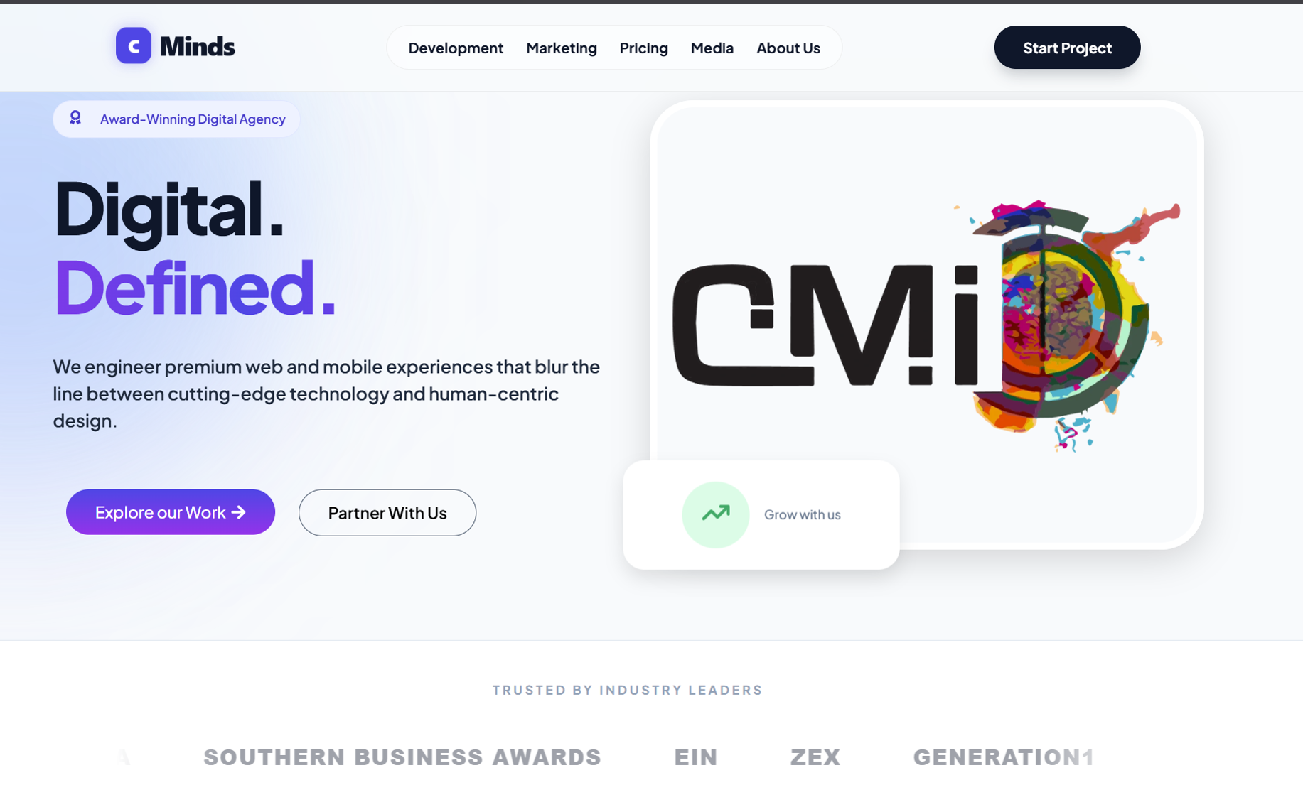
Same company. Same history. A completely different first impression.
 Before · 2019
After · 2026
Before · 2019
After · 2026
Drag the handle · Arrow keys also work
No legacy analytics existed, so results are reported in three tiers: verifiable structural changes, real data from the first nine weeks post-launch, and clearly labeled directional estimates.
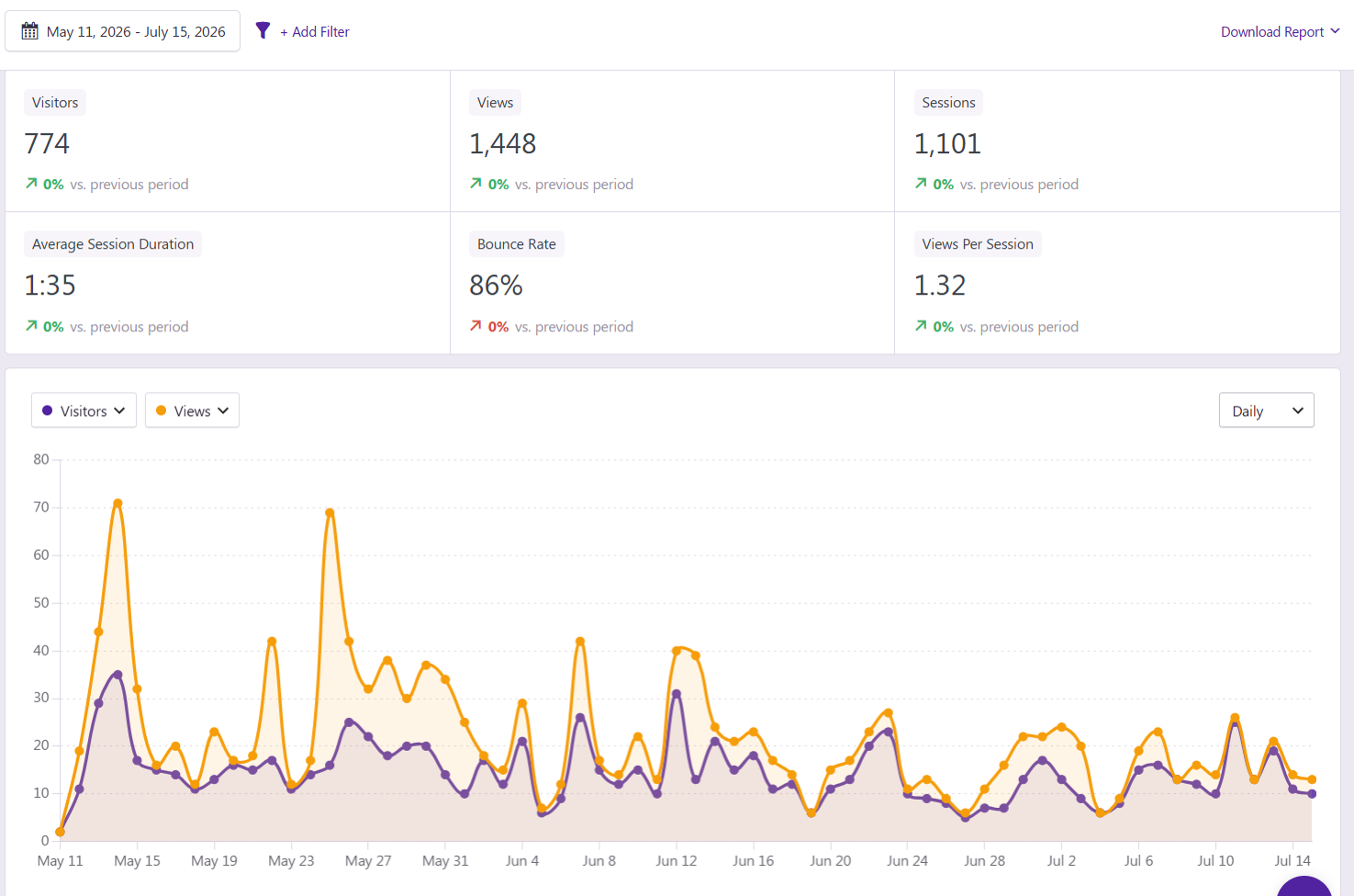
Post-launch analytics showed the 404 page receiving 24% of visitors, caused by inbound links still pointing to legacy URLs. I flagged it and scoped a 301 redirect map as the immediate follow-up, turning the analytics setup into an ongoing optimization loop instead of a one-time launch.
The hardest decisions were editorial: what history to keep, cut, or reframe.
The magazine roots could have been a liability. Repositioned as an origin story, they became the one thing that separates CMi from every other dev shop. And the 404 discovery reinforced why analytics belong at launch: a redesign is not finished when it ships, it is finished when the data confirms it works.