Secure2Go
Designing a safer way to buy, sell, and trade locally — a three-sided marketplace that treats trust as a design problem, not a disclaimer.
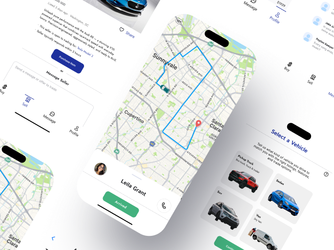
Local marketplaces run on strangers. Strangers run on trust.
Existing local selling platforms leave safety up to the user. Scams, unsafe meetups, and unclear logistics make lack of trust the single biggest barrier to completing a transaction. People want the convenience of buying nearby with the confidence of buying online.
Taking the lead
I joined Secure2Go as a design intern working alongside Janel A. Early in the project it became clear the product needed a single owner for the design vision, and I stepped into that role.
In practice that meant defining the information architecture for all three user types, building the design system from scratch, and running every design review. The client arrived with partial wireframes covering basic buyer and seller screens. The delivered product covers the full driver journey, identity verification, and delivery confirmation — all mapped, designed, and documented for handoff.
The title said intern. The Figma file says otherwise.
I came in as the intern. I left as the person who owned the design direction from architecture to handoff.
From discovery to pixel-perfect
Five phases, three user types, one system. Each phase fed the next instead of running in isolation.
Research
User interviews and competitor analysis of local marketplaces
User Flows
Mapping buyer, seller, and driver journeys end to end
Wireframing
Lo-fi structure mapped against core tasks per user type
Visual Design
High-fidelity UI, design system, and clickable prototype
Iteration
Refining layouts and flows on each round of client review
The building blocks of trust
A tokenized system built for clarity and accessibility: 12 color tokens, 4 type styles, and every component delivered as a reusable auto-layout element with defined states.
Tap any swatch to copy its hex value.
Six component families, every state defined
Built as reusable Figma auto-layout components so the system scales without redesign.
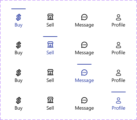
Navigation Bar
Default plus active states for Buy, Sell, Message, and Profile.
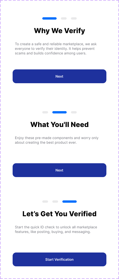
Driver Verification
Multi-step document upload and identity check states.
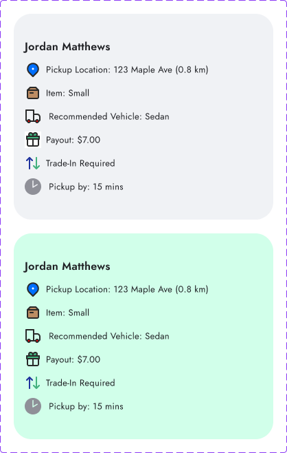
Orders Feed
Card variations showing payout, distance, and item details.
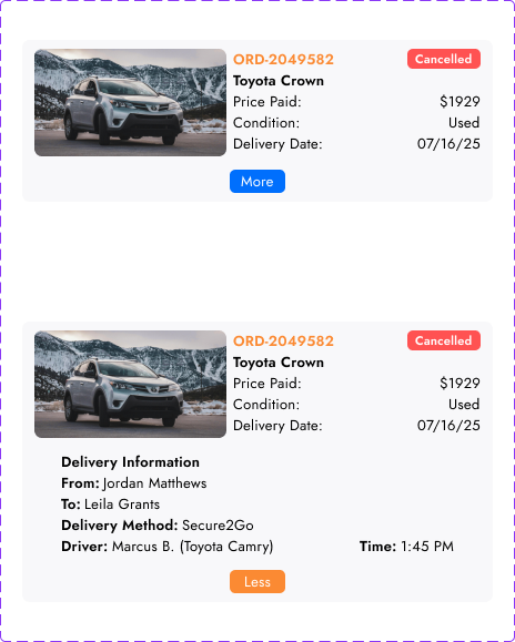
History Log
Completed transaction records and digital receipt states.
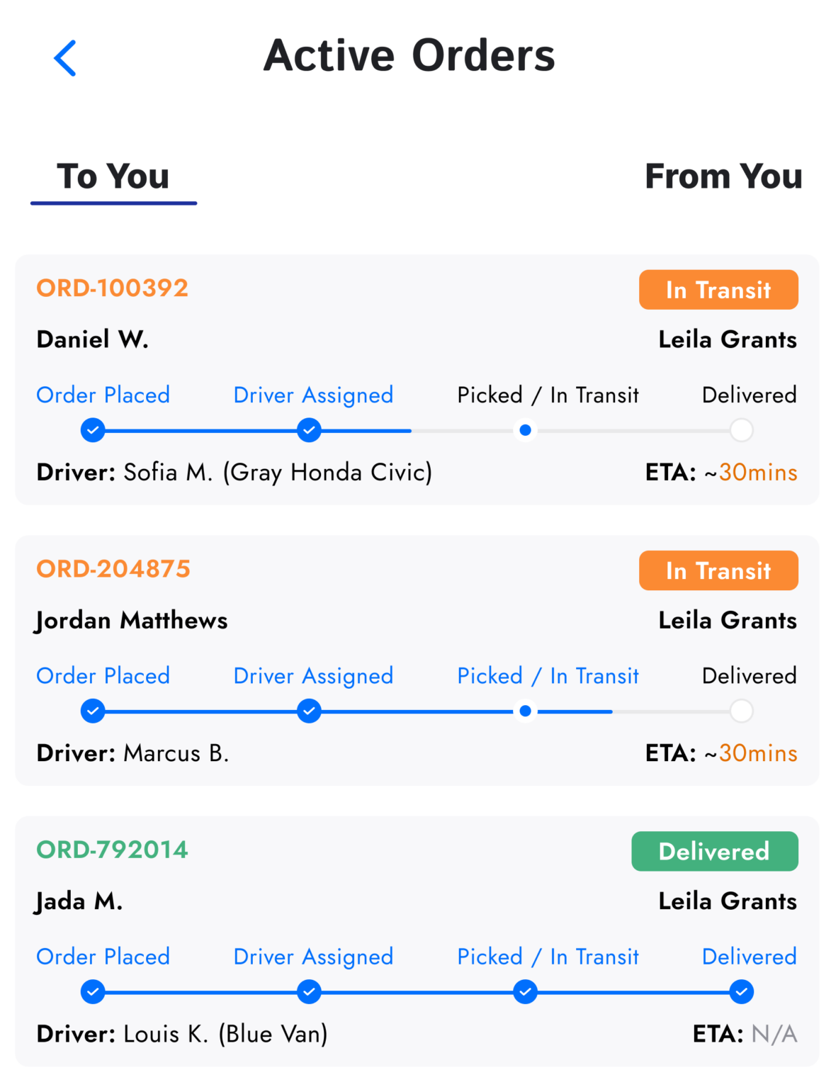
Incoming Dashboard
Live progress trackers for items in transit to the buyer.
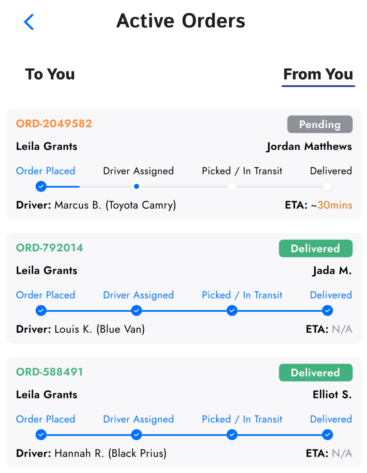
Outgoing Dashboard
Status monitoring for items sold and dispatched by the user.
Two people, one fear
Interviews surfaced two primary personas with different goals and the same underlying anxiety: dealing with strangers.

Leila
I love finding unique items nearby, but I’m terrified of scams and meeting strangers.
- →Safety concerns during in-person meetups
- →Uncertainty about actual item condition

Victor
I want to clear out my garage quickly without dealing with 50 messages and no-shows.
- →Wasted time on flaky buyers
- →Coordinating pickup logistics
Three journeys, zero blind spots
Each user type gets a distinct experience, and every transaction is visible to all three at every stage.
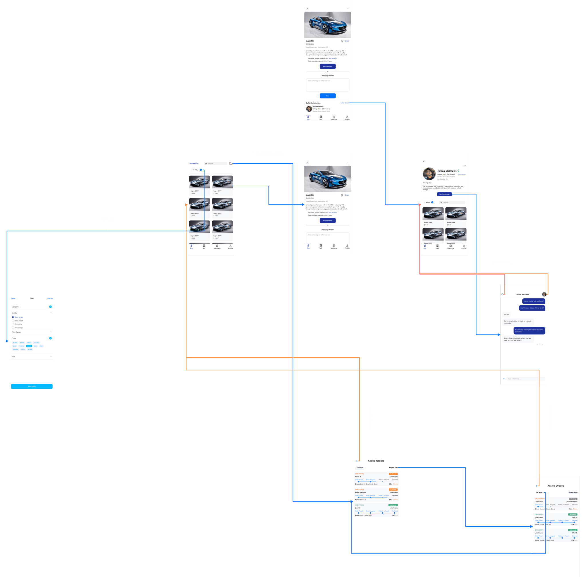
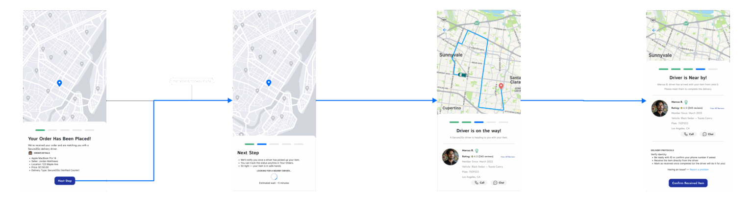
Shop nearby, track everything
Buyers browse verified listings, chat safely in-app, and follow their item door to door. The confidence of e-commerce applied to the item three blocks away.
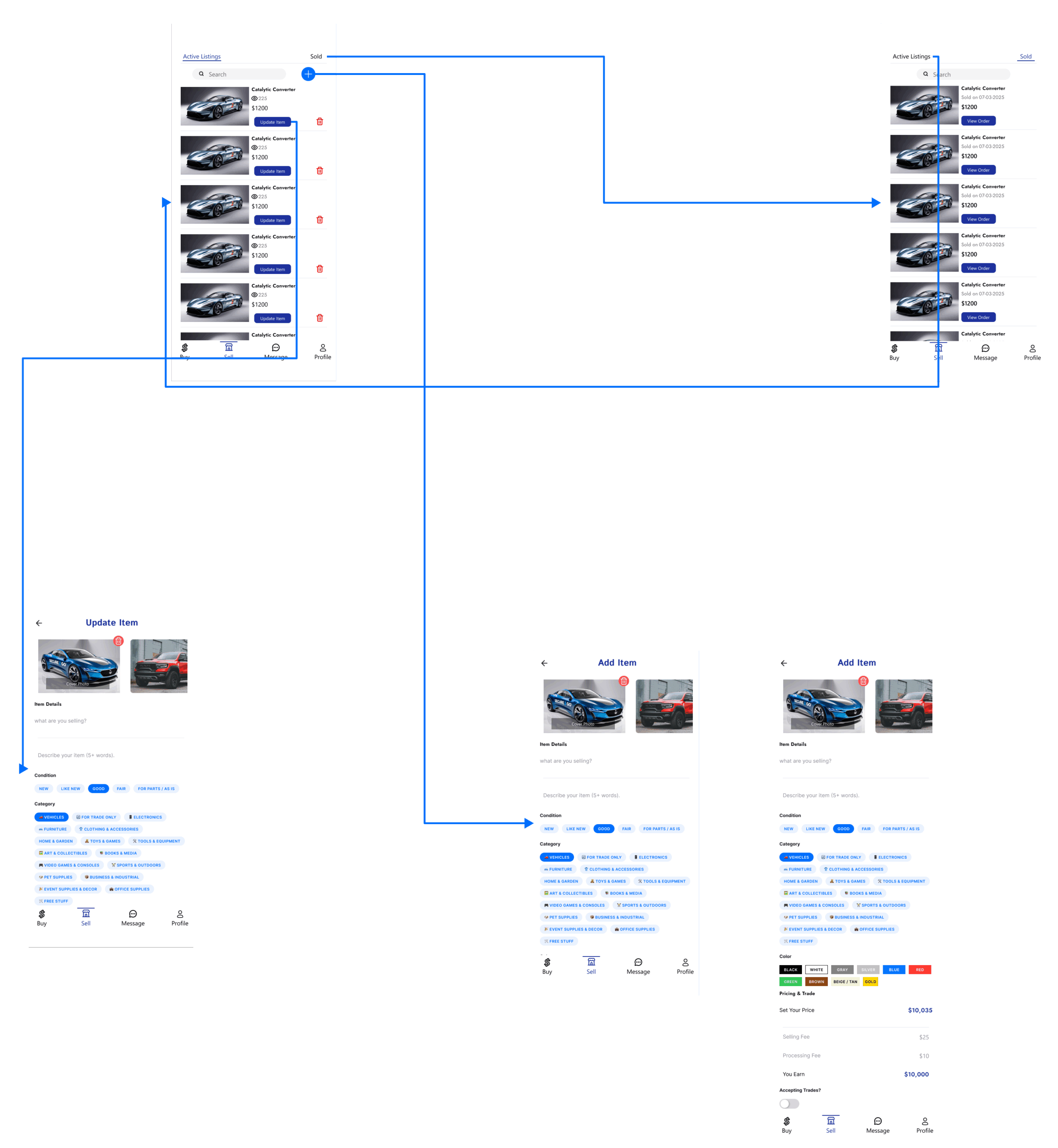
List once, skip the no-shows
Sellers manage listings and pricing from one dashboard and confirm a single pickup instead of coordinating with a parade of maybe-buyers.
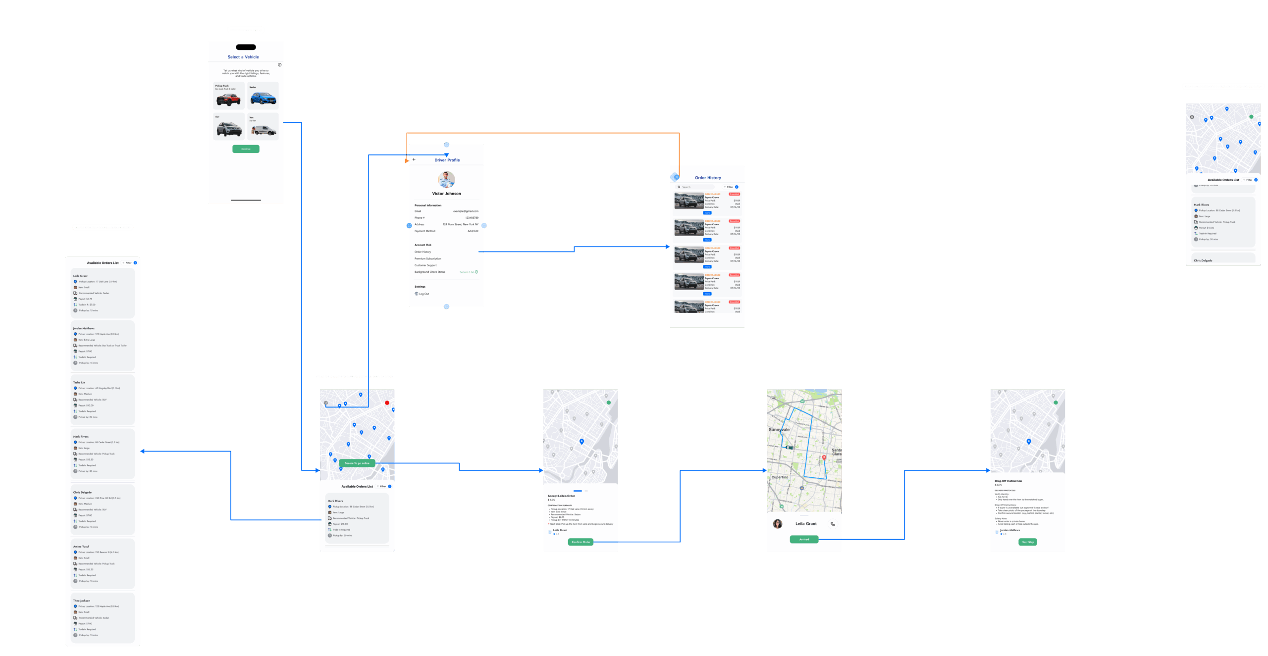
The journey the client forgot
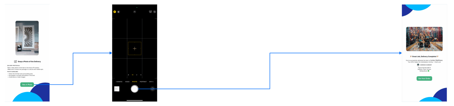
The driver experience was absent from the original brief. I designed it from zero: task acceptance, pickup verification, and photo-confirmed delivery, because the trust promise breaks without it.
Expanding the architecture
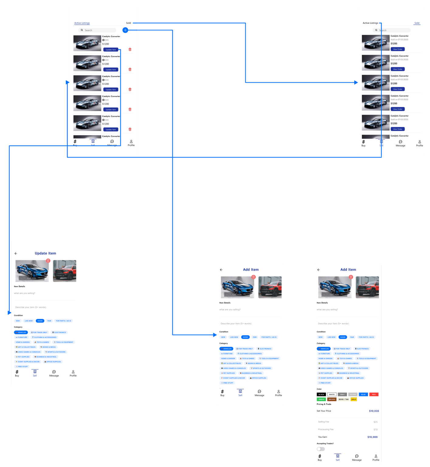
The client provided basic wireframes, but critical flows for drivers and safety checkpoints were missing. I expanded the architecture to include verification steps and real-time feedback, then reorganized layouts across successive review rounds to prioritize clarity over density.
What was delivered
Every number below is a fact you can open the Figma file and count.
Scope grew beyond the brief. The client’s wireframes covered basic buyer and seller screens. The delivered architecture added the complete driver journey, identity verification, and delivery confirmation checkpoints.
Handoff-ready system. Tokenized colors, documented type styles, and stateful auto-layout components mean a developer can build without guessing.
Client-reviewed at every stage. Designs were presented in recurring review sessions where the CEO walked the client through each update, then relayed requested changes back to the design team. The prototype was linked so the client and CEO could click through real flows between sessions, and each round of feedback drove the next iteration.