Piddle Paddle Tours
Analysis of the Tri-Fold Brochure for Piddle Paddle Tours
Project Description
Piddle Paddle Tours offers a variety of engaging and memorable tour experiences, including private and group tours, boat rentals, and various sea extravaganzas such as whale watching, fishing excursions, snorkeling with stingrays, and turtle nesting tours. The client sought a tri-fold brochure to effectively promote their services and destinations, providing potential customers with a clear, enticing, and informative guide to their offerings.
Design Specifications
The tri-fold brochure for Piddle Paddle Tours was meticulously crafted, adhering to the precise guidelines provided, demonstrating expertise in web design, UI, and graphic design principles:- Size: The brochure measures 11” x 17” flat, ensuring ample space for detailed information and captivating visuals.
- Bleed: A 0.25” bleed on all sides was applied, ensuring background colors extend beyond the cut line, preventing any unwanted white edges post-trimming.
- Gutters: A 0.5” gutter was used strategically to separate content between panels, ensuring clarity and readability without content loss in the folds.
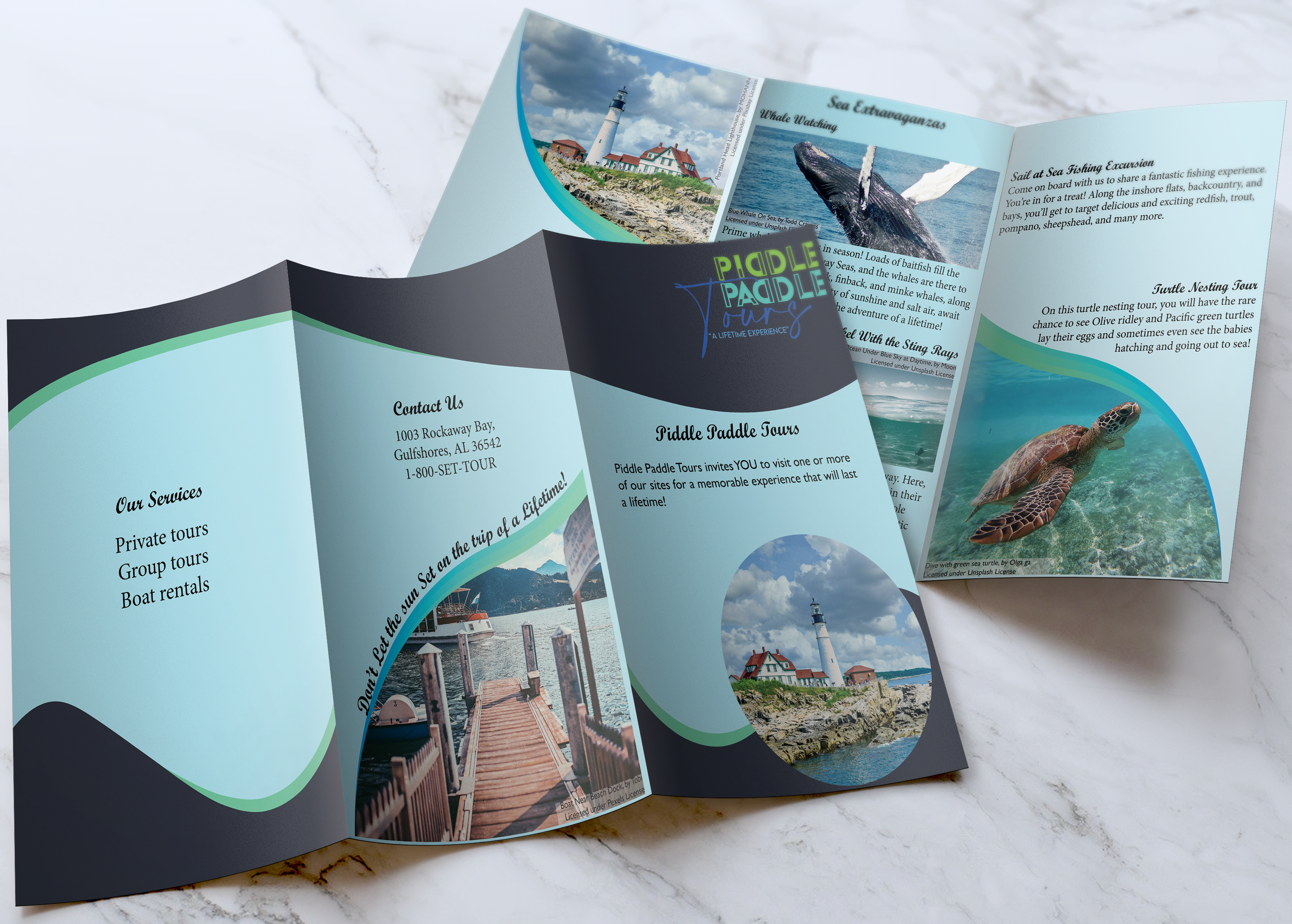
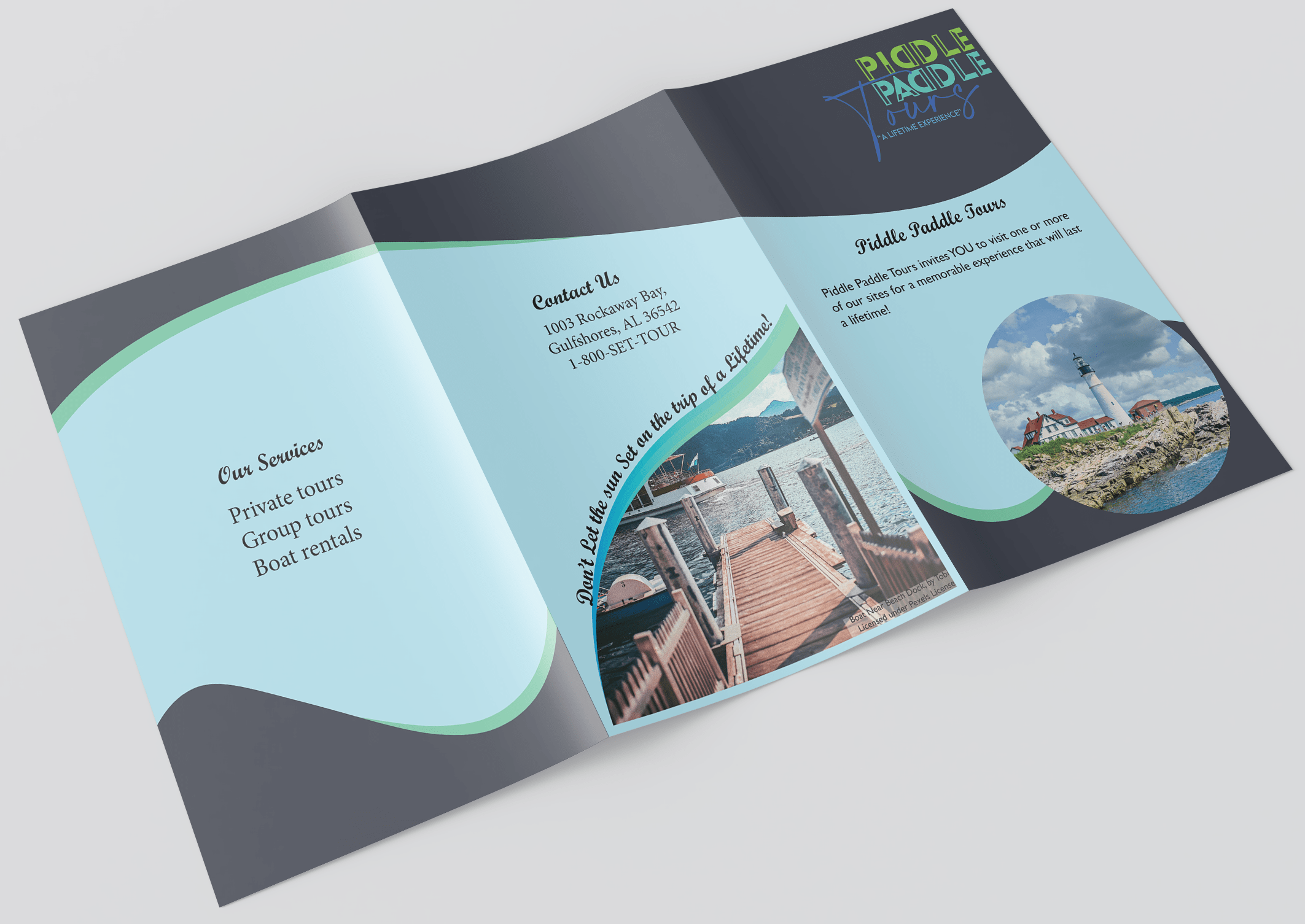
Front Page
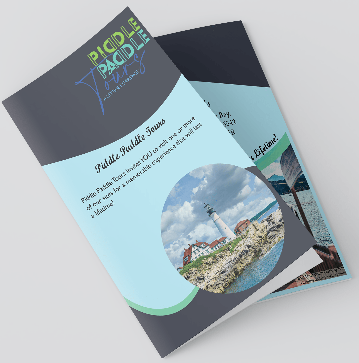
Cover Page:
- Company Name and Logo: Piddle Paddle Tours’ name and logo are prominently displayed, ensuring immediate brand recognition without overshadowing the main headline.
- Headline: The inviting headline encourages potential customers to explore the tours.
- Image: An engaging image was included to capture the viewer’s interest at first glance.
Middle Panel:
- Contact Information: Presents the company’s address and telephone number clearly, ensuring easy access for potential customers.
- Image and Call to Action: Includes a compelling image and message to encourage immediate action, reinforcing the urgency and excitement of booking a tour.
Right Panel:
- Services: Services such as private tours, group tours, and boat rentals are listed clearly, ensuring users can quickly identify the offerings.
Inner Page
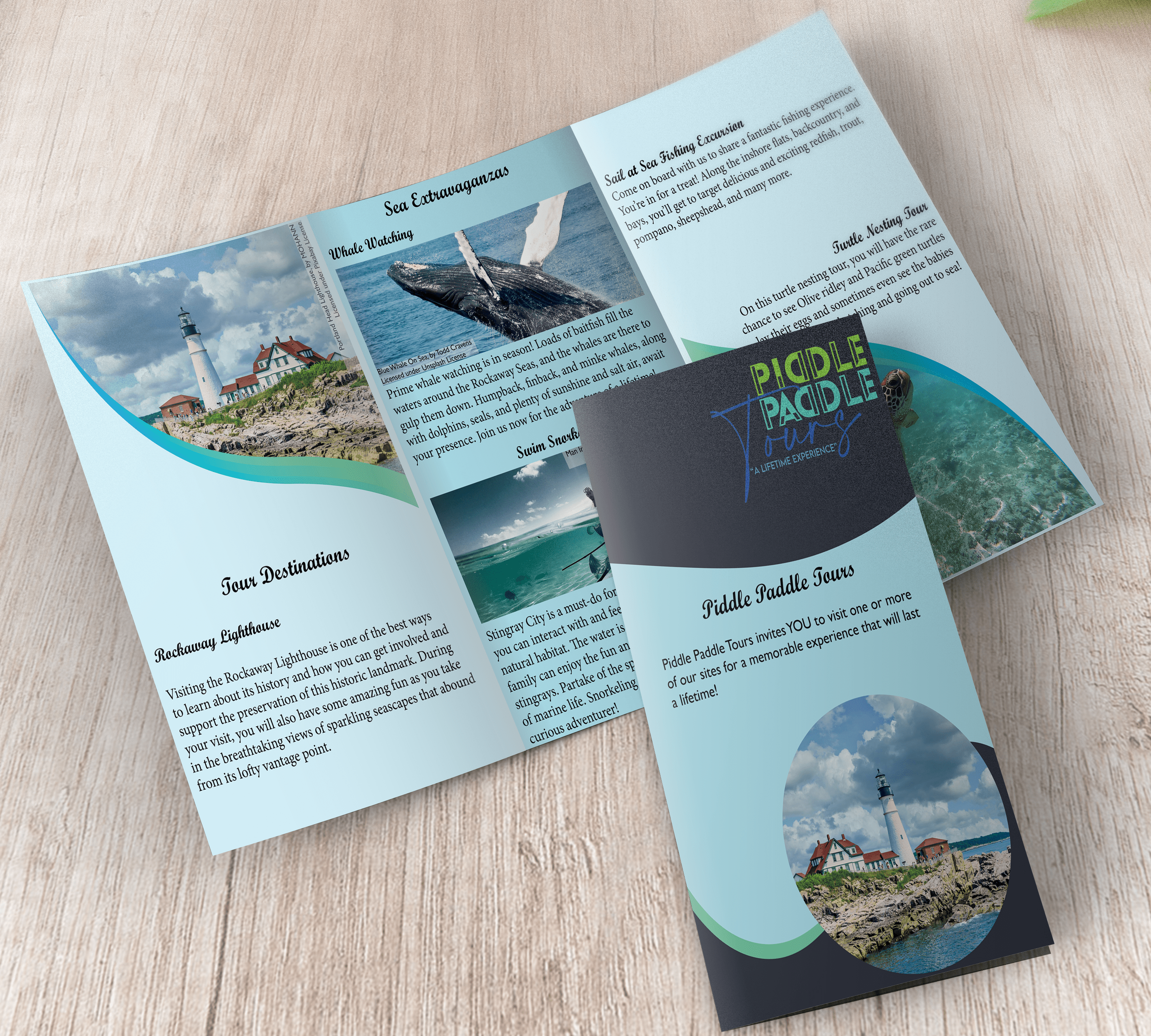
Left Panel:
- Tour Destinations: Rockaway Lighthouse is highlighted with an enticing description, inviting visitors to learn about its history and enjoy the breathtaking views.
- Rockaway Lighthouse: The description continues, providing more detailed information to sustain interest.
Middle Panel:
- Whale Watching: This section is designed with vivid imagery and descriptions, highlighting the excitement of whale watching.
- Swim Snorkel with the Sting Rays: Describes the interactive experience with stingrays, emphasizing its family-friendly nature and appeal to eco-adventurers.
Right Panel:
- Sail at Sea Fishing Excursion: The fishing experience is detailed with specific mentions of target fish species, catering to fishing enthusiasts.
- Turtle Nesting Tour: Highlights the rare and educational experience of witnessing turtle nesting, aimed at nature lovers and eco-tourists.
Brochure Specification Rational
Grid Analysis for Print Design:
- Manuscript Grids: Provide a simple and even division of space, promoting consistent margins and readability.
- Column Grids: We opted for column grids as they create vertical columns for content placement. This choice was particularly effective given the tri-fold structure, which inherently divides the brochure into three sections per page (front and back). Column grids ensure efficient use of space, maintain a clear reading flow, and help organize content logically within each panel.
- Modular Grids: Use a combination of horizontal and vertical divisions to create a modular system for content arrangement, offering flexibility while preserving a cohesive design.
- Hierarchical Grids: Prioritize content hierarchy, guiding the viewer’s eye through the layout with varying sizes and positions for elements, enhancing visual appeal and information organization.
Each grid type was carefully considered, and the decision to use column grids was based on their effectiveness in structuring a tri-fold brochure. This approach ensured that the brochure was structured, readable, and visually appealing, tailored to the specific design objectives and content characteristics.
Implementation of Client Design Specifications:
- The brochure’s 11” x 17” size was precisely followed, allowing comprehensive content presentation.
- The 0.25” bleed ensured that the background colors extended beyond the trim line, avoiding any white edges after trimming.
- The 0.5” gutter provided sufficient space between panels, preventing content from getting lost in the folds and enhancing readability.
Showcasing Design Skills
This project showcases a range of design skills:
- Web Design: The layout and structure reflect an understanding of web design principles, ensuring the brochure is user-friendly and engaging.
- UI Design: Emphasizing intuitive navigation and content hierarchy, the brochure guides users effortlessly through the information, mirroring the best practices in user interface design.
- Graphic Design: The consistent use of typography, color schemes, and imagery aligns with graphic design standards, creating a visually appealing and cohesive brochure.
Conclusion
The Piddle Paddle Tours tri-fold brochure exemplifies a harmonious blend of web, UI, and graphic design expertise. The careful attention to design specifications, strategic placement of copy and images, and the effective use of grid structures all contribute to a professional, engaging, and informative promotional tool.
This project highlights my ability to create functional and aesthetically pleasing designs that meet client specifications and enhance user experience.